
Charting data in Microsoft Excel for visual analysis can be quick and easy, thanks to sparklines! Just last week, I was evaluating some demand data and wanted to visualize which products had stable demand and sort them from the products which had inconsistent demand. This, along with many other use cases, can be quickly visualized.
First, start with your dataset. The data may be displayed in a series horizontally or vertically. Let’s imagine the dataset below is a sales history for 4 different products.
 |
| Example dataset without sparklines |
Since my data is displayed horizontally, I will add sparklines in Column N. To do this, go to the Insert tab on the navigation ribbon and look for the Sparklines section.
 |
| Sparklines options on the Insert tab |
Let’s select the Line option for sparklines and enter the data range and where we want the sparklines to be placed.
 |
| Create Sparklines dialogue box for selecting data range and where to place sparklines |
We now have sparklines! but what happened with Product C? Shouldn’t we have some data for this? We should, but the type of sparkline chosen will not represent this due to the blank spaces between the values.
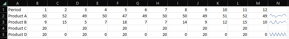 |
| Results of adding sparklines, but what happened with Product C? |
You might have noticed the values for Product C and Product D are the same, but Product D uses 0 as a value where no sales history occurred, while Product C does not. The result is “stranded” data points.
In the next free column, let’s try using the Column option for sparklines. Here is the result:
 |
| Sparkline Column option displays data for Product C |
This looks better! However, the visual is a bit small. Since the sparkline size is tied to the size of the cell it is placed within, we can simply adjust column and row sizing for an improved visual.
 |
| Adjusted row and column sizing to improve visual of sparklines |
Use cases for the Win/Loss sparkline include tracking gains and losses of stocks, or profit and loss visuals. I won’t display any visuals of this here, so feel free to experiment with this sparkline to see if it meets your use case.
Sparklines can be a great way to quickly visualize data and make business decisions without the need to know how to create a visually appealing chart. They are extremely useful if you need to visualize individual data elements row-by-row (as we did here) or column-by-column, as you can create visual interpretations of the data in seconds.